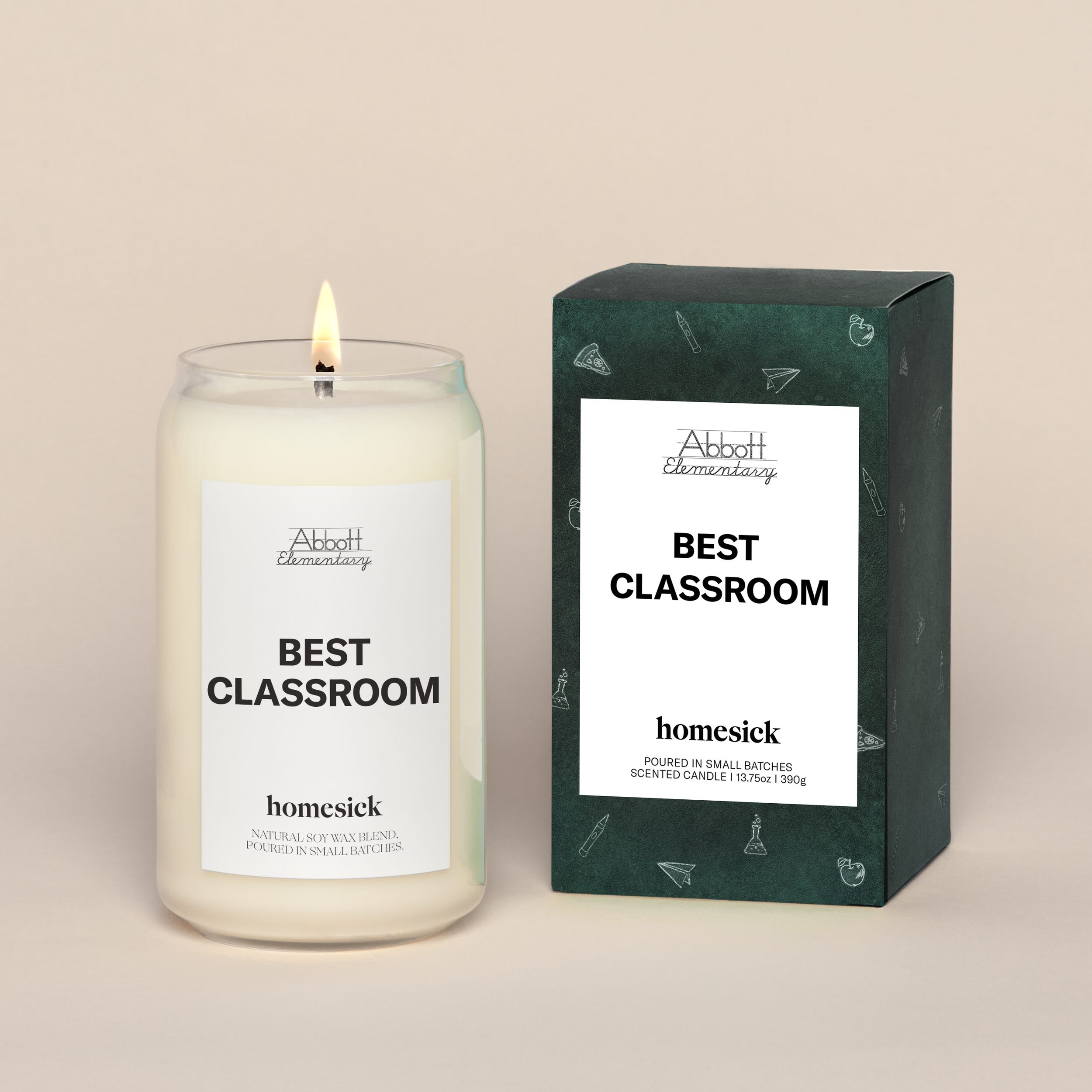

Homesick Packages
Homesick has done an incredible job when it comes to brand collaboration. It’s an exciting opportunity and everyone wants a signature scent. Once that scent is designed, the challenge is to create a visual system that gives context to the aromas as well as the brand identity it’s derived from.
I always push for continuous designs that wrap the entirety of the box so that every angle looks pleasing. I found that I needed to simplify designs to make sure the packaging was going to play nicely on shelves, next to other products, and in homes. For me the goal is to make the customer desperately want to open the box but also a little reluctant to toss it after the fact.

Mindful Monday Design System
The initiative aims to make excellent mindfulness practices accessible to everyone. It required a balance of friendliness and authority, resulting in a professional yet warm tone. Rounded shapes provide a sense of calm while hard lines imply organization and structure.
Given our heavy reliance on body awareness, we understood the necessity of using characters to demonstrate physical exercises. The mascots we created have a blobby structure that makes them easy on the eyes, with each one appearing to 'float' to evoke a relaxed feeling. We created a variety of body shapes, each slightly larger, to ensure that all users feel welcome. This was also bolstered by a variation of the mindful 'contented' face.
This was easily one of my favorite client projects.

Scam Awareness Campaign
"Scam Syndicates" are gaining power in the developing world, luring people into forced labor as online scammers for long hours. I had several exchanges with a team in Myanmar working to free victims and help them create powerful campaign assets.
“The main way we can fight back is simply spreading the word,” one of the volunteers told me, explaining that when the public is aware, the flow of people to the centers stops.
A dire situation; the color red felt too overwhelming. We decided to use a bright orange and yellow color scheme to alert viewers and get their attention, without making them feel hopeless. We really wanted it to feel like we were documenting the situation as it unfolded. I studied a handful of news outlets and documentary films to create a polished and striking look that would encourage sharing.
Today, when we are competing for attention, having the text and images easy to digest was key.

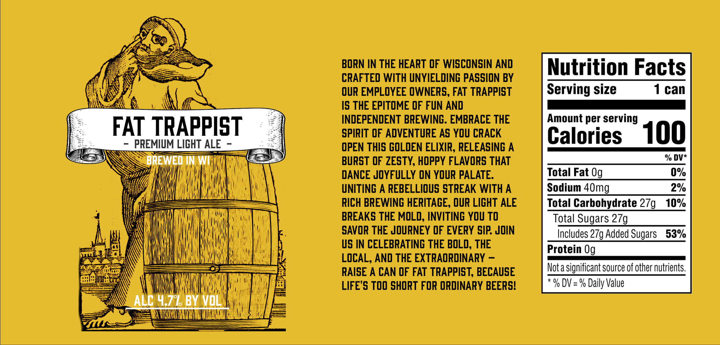
Fat Trappist
The beer can is the blank canvas for the designer. There are so many welcomed styles and practices, it can be hard to choose where to go. We wanted to pull from the long history of trappist beer with a modern and approachable twist. We used block print styling for our main image (inspired by a real antique pamphlet) but opted for only one color to pair with it to keep things mellow (much like the beer itself).